Introduction
Middle school is a time of great change for students. They have greater academic challenges and expectations, they experience physical changes, and their social interactions begin to shift. This much change can cause distress and threaten a student’s mental wellbeing. Pluck works to destigmatize mental health by reminding students that they are not alone in their struggles.
This project started as a group assignment with Cat Palacios and Regi Obenza under the name Budz; afterwards it was expanded and rebranded to Pluck as a solo endeavor.
Timeline
5 Weeks
Deliverables
Brand Identity—Logo, Color Palette, Typography, Illustrations
App—Site Maps, Wire Frames, Prototype (Student, Counselor)
Touchpoints—Notepad, Lanyard, Button Pin, and Pencil
The Brand
Pluck’s mission is to support the mental wellbeing of middle schoolers across the United States. With stigma surrounding mental illnesses, it can be hard for students to share their struggles, and studies from the National Association of Secondary School Principals (NASSP) show that nearly 75% of middle school students need mental or emotional assistance.
This app makes maintaining mental health more manageable for students by providing them with coping strategies and mental regulation exercises. Pluck can be integrated into a school’s system, allowing students to log in through their schools and message their school counselor on a platform that is compliant with ethical and privacy guidelines set by the American School Counselor Association (ASCA) and the Family Educational Rights and Privacy Act (FERPA).
Brand Identity
Name
Previously, this project was named Budz to build community from “bud”, the shortened form of “buddy”, while tying in to the gardening theme. However, since Budz could be mistakenly associated with marijuana, the name was changed to Pluck. The new name similarly connects to gardening and amplifies the message of mental self-care. If a person’s mind is a garden, they must pluck the weeds that can cause mental illness.
Logo
In order to appeal to middle schoolers, the logo is a custom wordmark that has both rounded and sharp aspects. It is fun and bubbly without being too childish, and it ties into the gardening theme with the stems of letters resembling blades of grass.
Thumbnails
Rough
Final
Color Palette
The colors of Pluck are calming and healthy. Two greens and a yellow are the primary colors, representing the essential colors of life: the ups, the downs, and the in-betweens. The other colors featured throughout the app, provide variety and emphasize individuality.
Typography
Two typefaces are used throughout the app: Bubblegum Sans for the display and Assistant Semibold for the body copy. The display type is organic and lighthearted, and the pair contrasts well in order to create hierarchy.
Illustrations
The background illustrations feature natural elements that can be seen in a garden. Leafy vines, worms, anthills, and tulips all provide thematic visual interest and texture in a bright and colorful way.





App
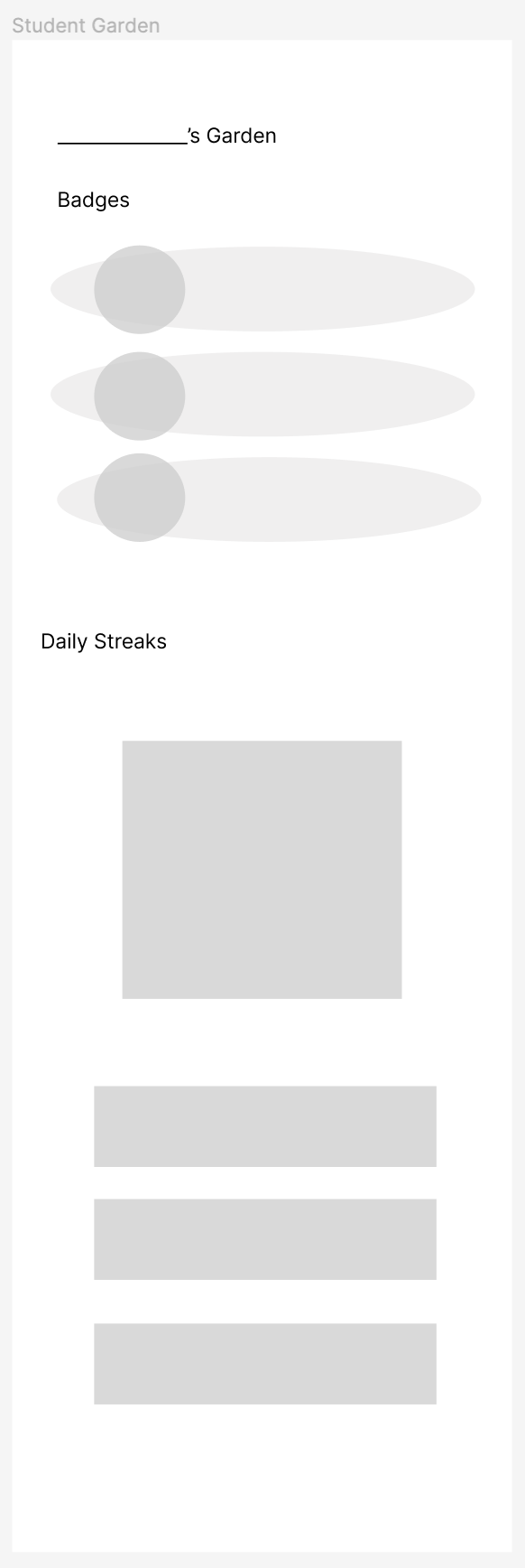
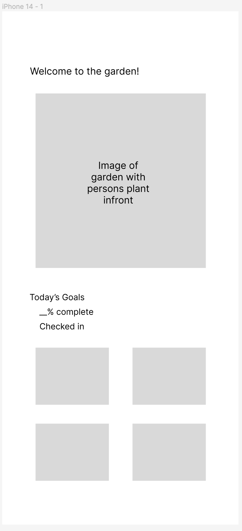
The app’s features include activities like journaling, drawing, and meditation to help with mental regulation. It also includes the ability to message the school’s counselor, and anonymously shows classmates’ stats.
Site Maps
Wireframes
by Cat Palacios

Prototype
The prototype features two flows: one for the student’s view of the app, and one for the side of the counselor to showcase how each user interacts with their side of the app and with one another.
Student Prototype
Counselor Prototype
Touchpoints
A number of touchpoints were developed to accompany the brand. Notepads, lanyards, button pins, and pencils are all items that students would regularly need and use at school, which would help remind the students that Pluck is a resource available to them.
